About this project
A redesign of the website of Casper Maas Fotografie, where I integrated UX and UX writing principles and added a brand voice.
Roles: UX writer, Information architect
Skills: UX design, UX writing, information architecture, user research
Tools: FigJam, Adobe Portfolio, Notion
Exploration
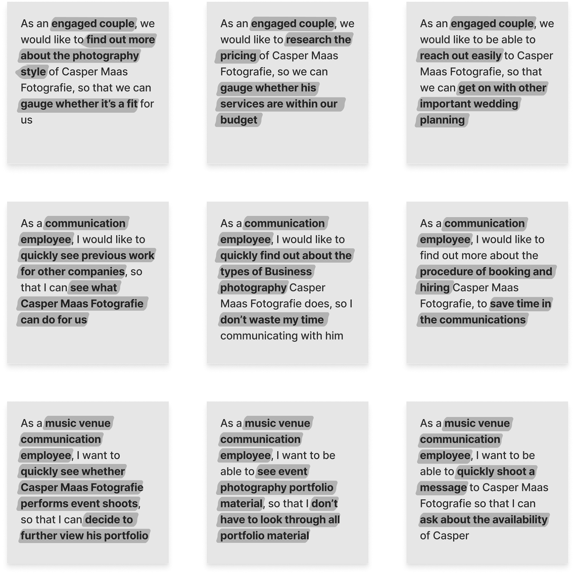
User Stories
To shed light onto the most important changes that had to be made, first a number of user stories were created for common clients of Casper Maas Fotografie: two communication employees, one from an event venue and another from a ‘regular’ business and one couple looking for a wedding photographer.
User stories
User Flow
To gain insight into a suitable new structure for the website, two user flows were created.
A user flow was worked out for two types of potential clients of Casper Maas Fotografie: a user who is already familiar with Casper (i.e. through word of mouth) and a user who just found Casper's website through Google. The first user in this case searches more targeted (immediately goes to the page with information that is relevant to them specifically), where the second user is trying to get a good impression of Casper first.
Both are users commonly visiting Casper's website, so both flows are equally relevant.

Simple user flow
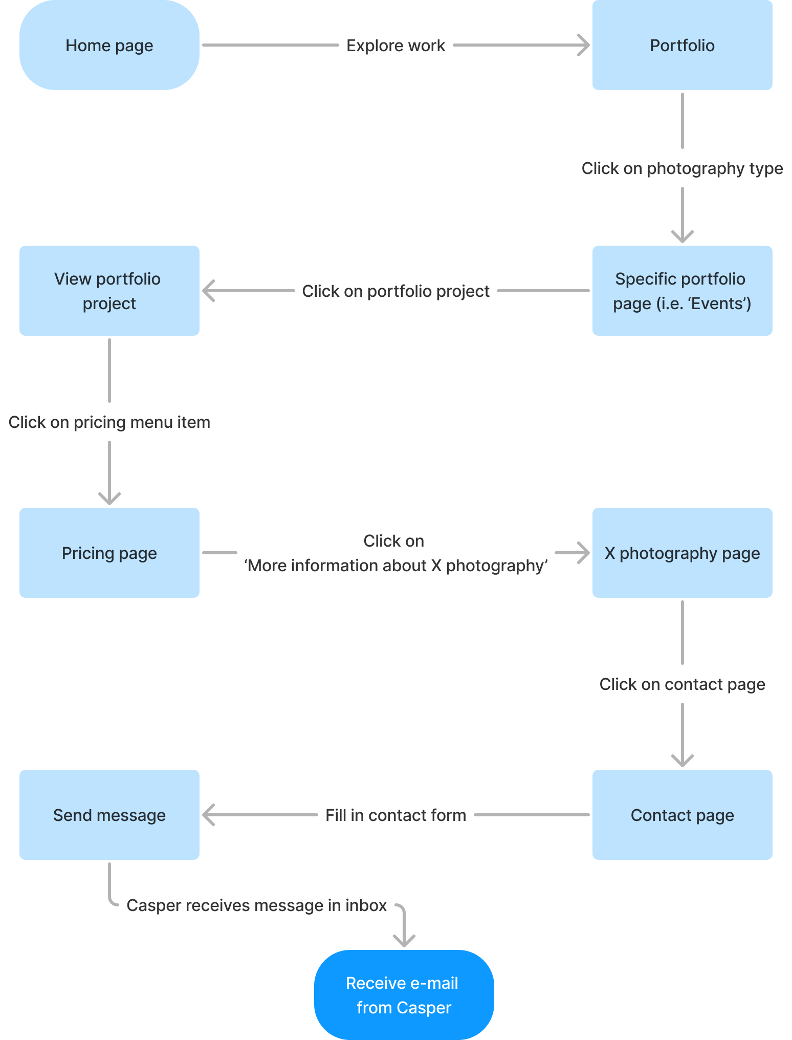
Extensive user flow
Design choices
Home page
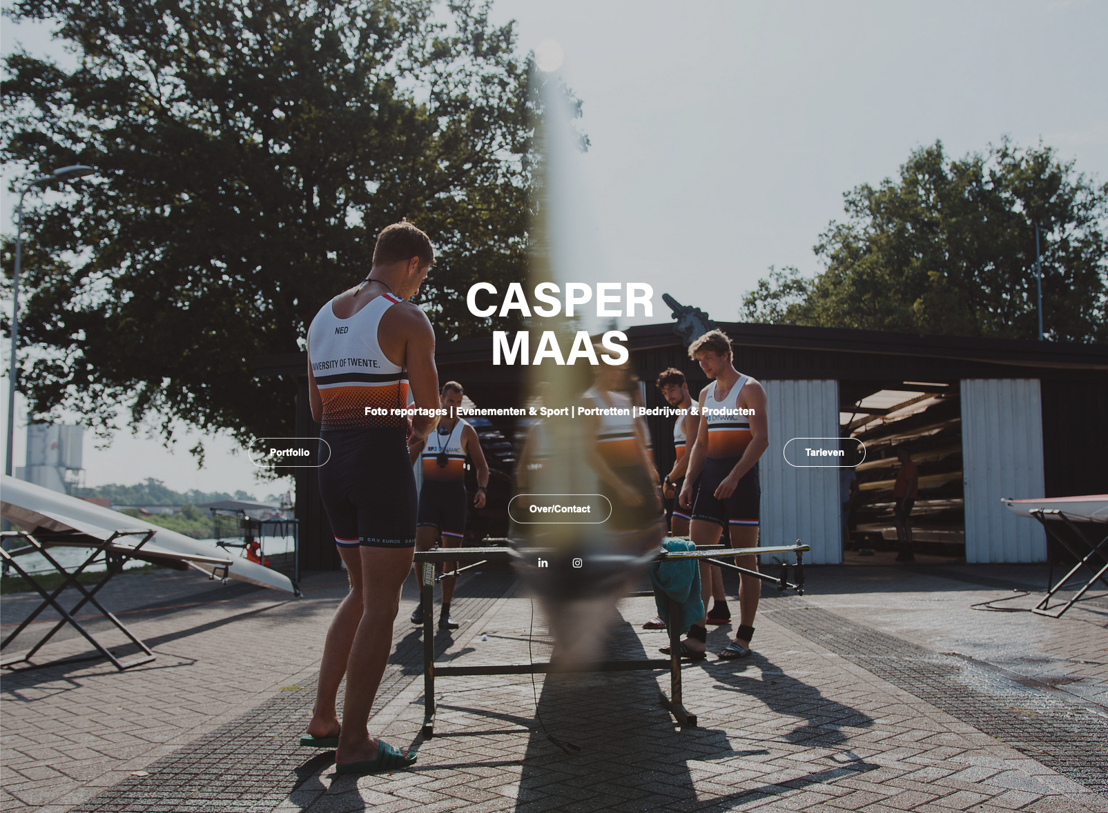
One of the most prominent changes to the website has to do with the change from a landing page to a home page.
Previously, when entering the website the user saw a landing page with a full-screen background image. This made the text hard to read and the user was not really directed to the next step. Also, the fontsize was too small to be accessible for all users. The buttons were distributed in a misaligned way (due to constrictions of the software in which the website was built) and the text that described the different types of photography gave the idea that it was clickable, but it wasn’t. The way to direct to more information on the specific types of photography was not intuitive or quick.
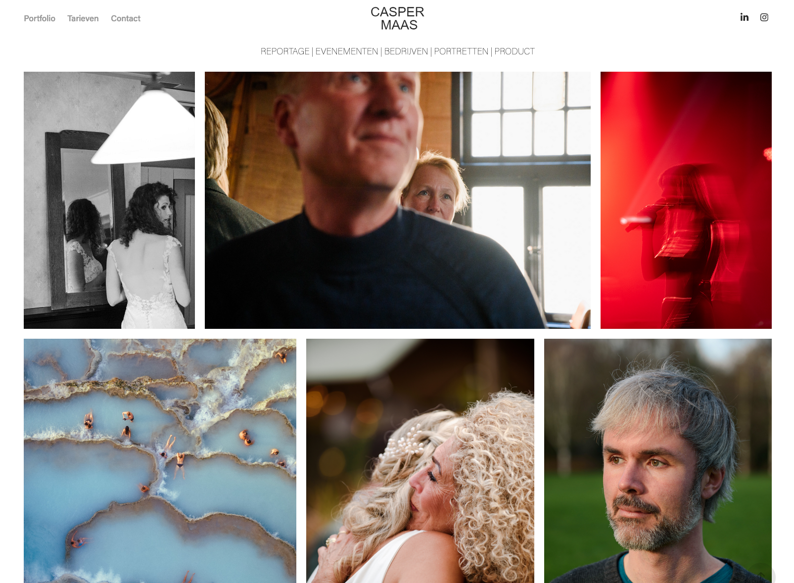
In the new website, a home page was created instead, where a large collection of photographs are displayed, showing the identity of Casper Maas as a photographer. All sorts of photography types are displayed here, to give a wide palette of photos, all displaying the style of Casper and providing inspiration of what is possible if you would hire Casper as a photographer.
At the top of the home page, the different types of photography are mentioned and will in the future redirect to the corresponding information pages (the website is currently still under construction). This way, if a potential client already knows about Casper (from word of mouth for example), they can immediately go to the relevant section for their needs. If a potential client finds Casper’s website through Google, they might first need more of an impression of Casper’s work and personality.
The home page contains such a large selection of photographs that it feels like you can keep scrolling endlessly. When a user decides that they have seen enough of an impression, they can decide to dig deeper for more specific portfolio cases or information about the pricing and process of booking Casper. This can easily be done, even when they have scrolled all the way down, as the menu bar remains at the top of the screen.
Old landing page
New home page
Navigation
In the old portfolio, the user flow was not represented well in the menu structure. The order of menu items was changed to the order in which potential clients go through the website and the way that a selected menu item was visualized was also changed (to a darker color text, instead of only using a bold font). These alterations enhance the user experience by guiding the user through the website, clearly indicating where they are currently located.

Old menu structure

New menustructure
Layout and writing
Further alterations were made in regards to layout (making it more consistent in terms of spacing and sizing) and in regards to the writing. The weight of the photo of Casper and the text next to it is better distributed in the new portfolio, giving the whole page more breathing room. Also, previously no structure in terms of headings were used, so this addition already gives a user a better overview in just one glance.
Furthermore, the About me text was created when Casper Maas Fotografie was just starting out. It no longer represented the professional maturity of Casper and therefore the phrasing was altered. Instead of ‘mijn eigen bedrijfje’ (Dutch for: my own small business), which might come across as unprofessional and immature, we now use more confident wording, such as ‘My work as a photographer’.
A final addition was that a contact form is now present on every page from which it makes sense to reach out to Casper (all 'More information about X photography' pages and the contact page).
Old contact page

New contact page
