About this project
During this internship I worked together with the Design Team on design work-items and I focused on developing a user testing process and protocol for the product design team at Embrace.
This page describes the process of development of the user testing protocol.
Roles: (UX) researcher, UX designer
Skills: UX/UI design, prototyping, UX research
Tools: Figma, FigJam, UseBerry, Notion
Duration: 6 months
Challenge
To make it easier for the design team to perform usability tests, both online as well as in person, with clients, a specified user group or colleagues.
Solution
A dashboard in Notion containing all necessary documentation and tools to perform different types of usability tests, tested and ready to go for the design team.
Execution user test
Approach
The process of creating a protocol for user testing followed the Double Diamond design process model, altered to the wants and needs from the stakeholder, the design team at Embrace. At the start of the project the steps of the project were defined as a rough guideline.
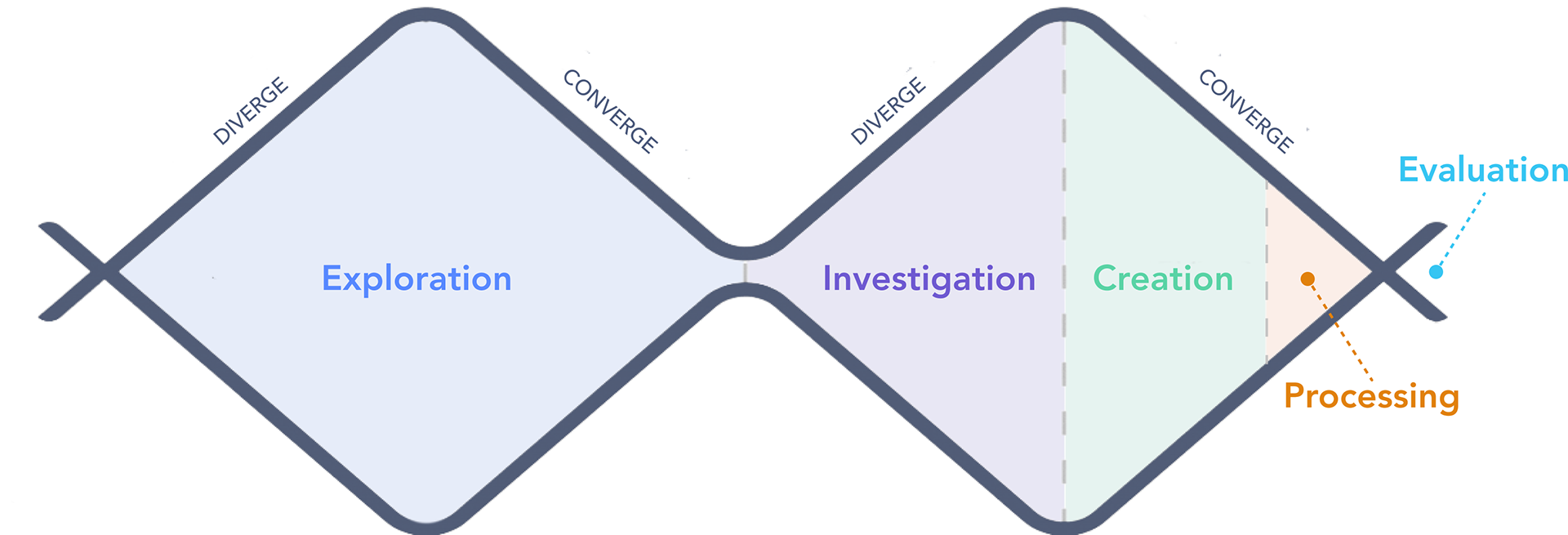
Double diamond process
Exploration
Diverge
The exploration phase is split up into a diverging stage and a converging stage. First, a wide research is performed to gain insights into what is the state-of-the-art in user testing methods and what each method entails.
All types of relevant distinctions are researched: online vs. in person testing, individual vs. group context, quantitative vs. qualitative and moderated vs. unmoderated.
All of these findings were summarized in a (toggle) list of potential user testing methods, with a brief summary of what the methods entail.

Overview user testing methods
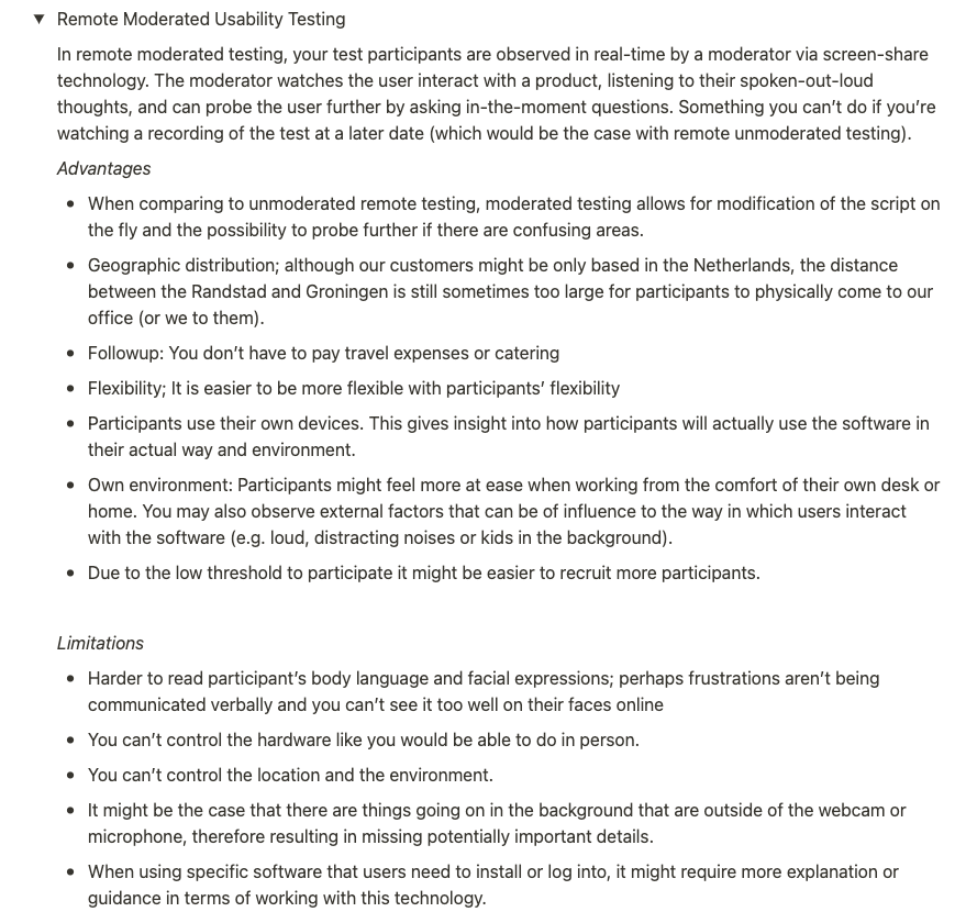
Example remote usability testing summary
Converge
Next, this list was categorized in 'red', 'orange', 'yellow' and 'green' to indicate how well the user testing method fits with the company wishes and possibilities (green meaning a good fit, red the least fitting).
This was done through consultation with the Design Team members and Team leader of UX, to determine the feasibility of, for example, in person testing.
From this it became clear that A/B testing, desirability studies, Interviews, and different forms of Usability testing were interesting to further discover.

Ordered user testing methods by color
The green and yellow coded user testing methods were then examined in the context of the Design Thinking process. This provided insight into which phase each user testing method is most suitable for.
It turned out that the main bottleneck in testing happens at the prototype stage, where a well-functioning early design needs to be tested with users. The most logical outcome from this discussion was to go forward with the different forms of usability studies, as it was not feasible in the timeframe to work out all of the user testing methods as a protocol.
Another finding was that the design-team had a misconception on what A/B testing is: in reality it is a method to test two (high-fi) prototypes using metrics such as click-through rate and conversion rate. The wishes of the design team corresponded better with 'Comparative Usability Testing'.
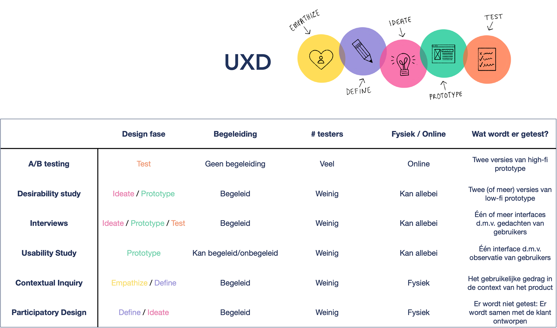
Table with overview of top 5 user testing methods
Investigation
Diverge
A dashboard was created for the user testing methods found in the previous phase. A distinction was made between in person and online testing and comparative testing (which can be both online as well as in person). Each test has similar preparatory materials, so the necessary documents are all gathered in the same dashboard.
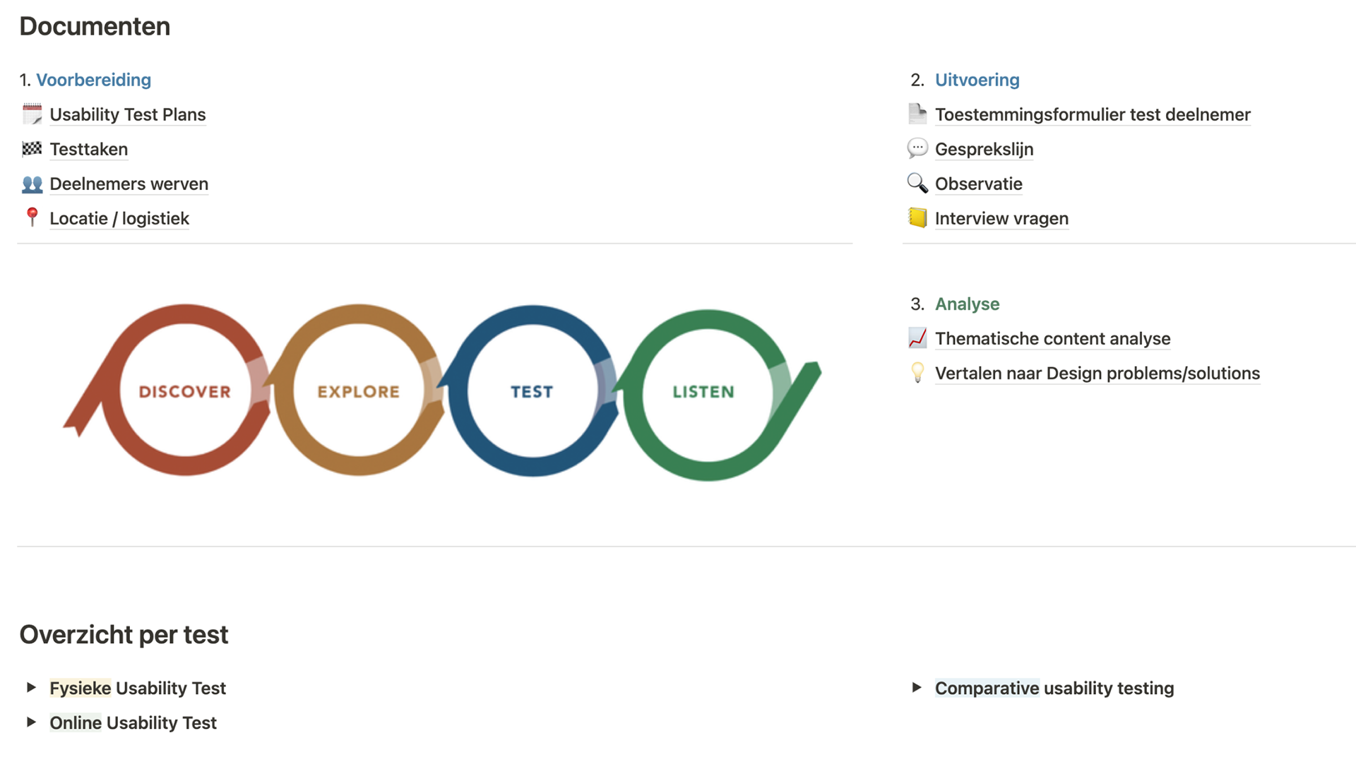
Dashboard
For each usability testing method a toggle is created in which a step-by-step protocol (linking to the documents in the dashboard) is described.
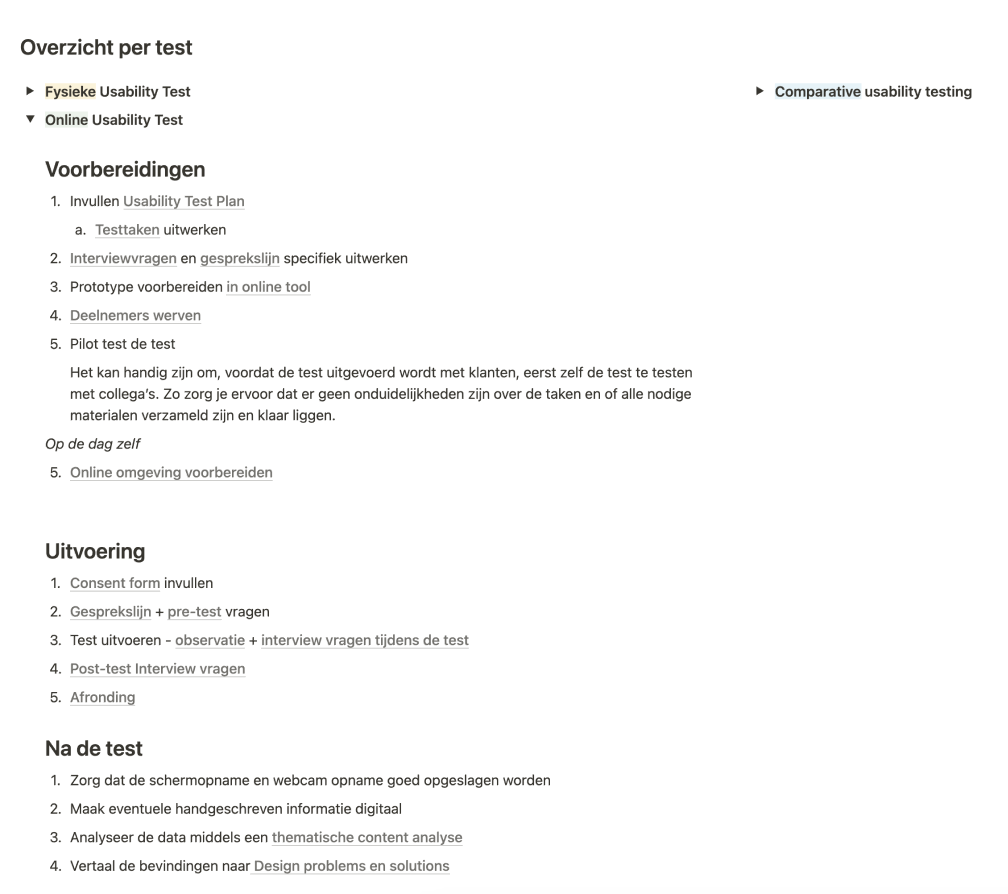
Example online usability test
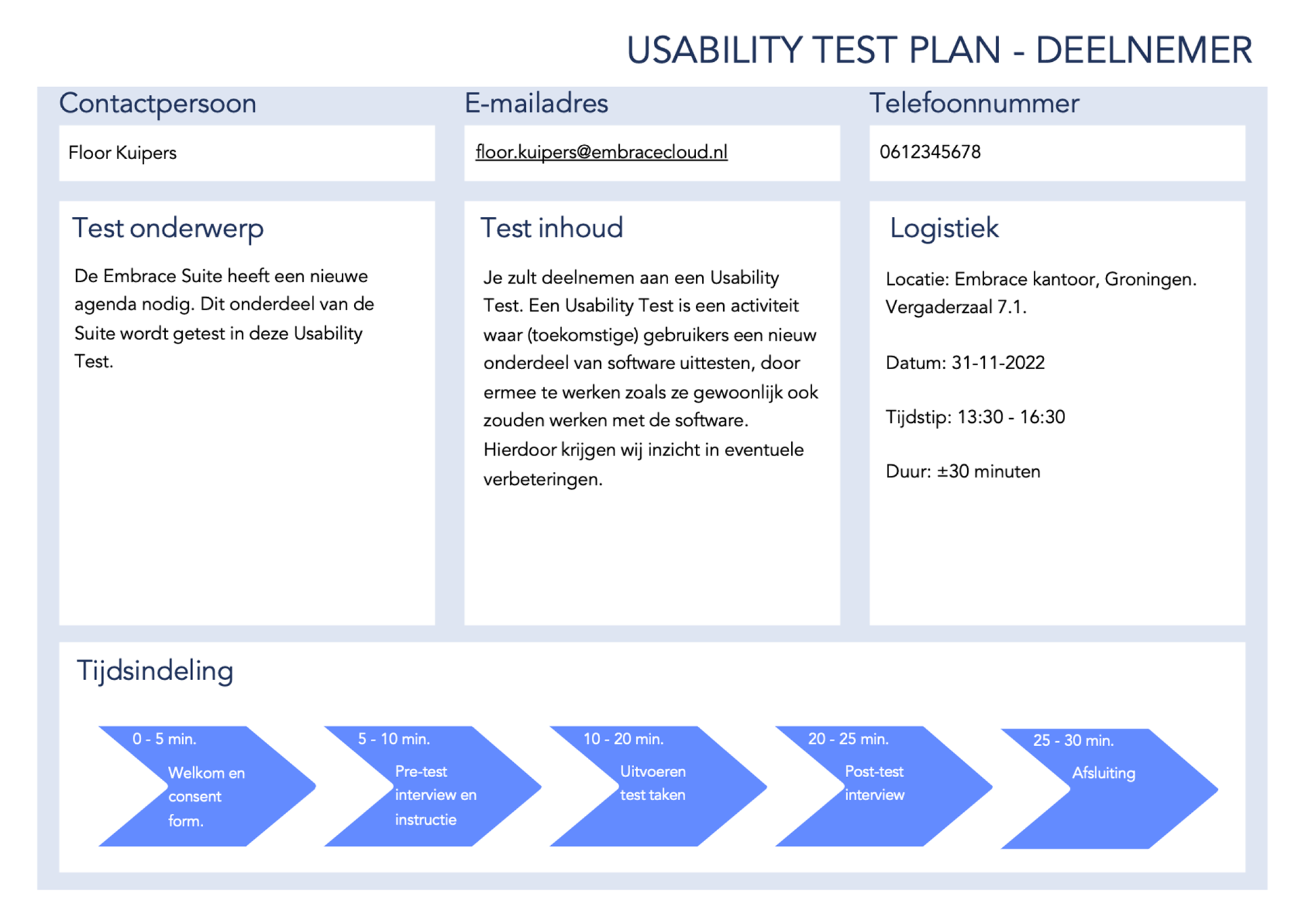
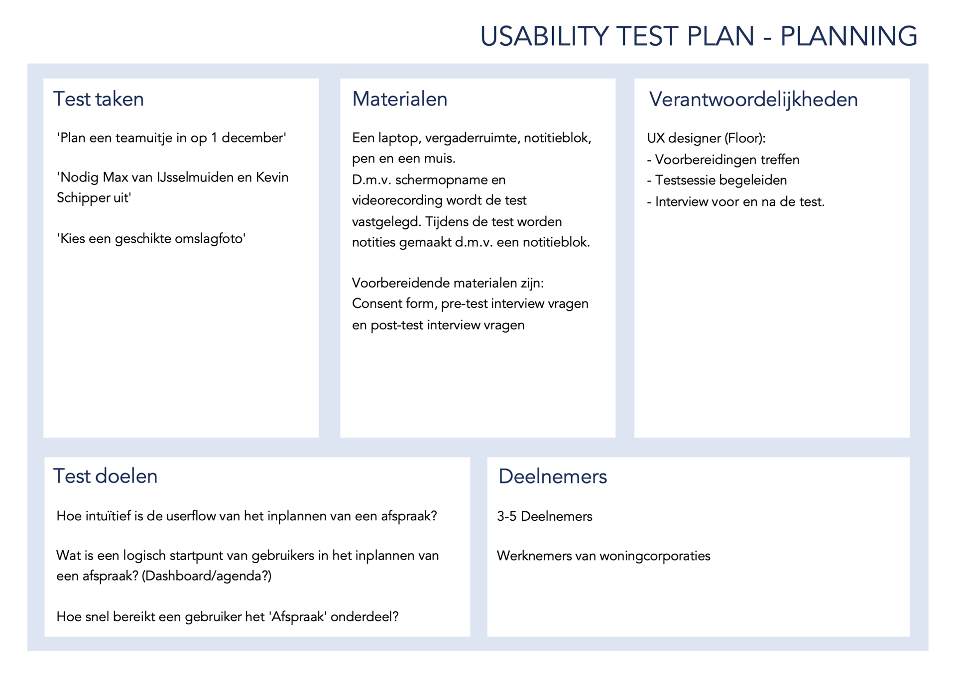
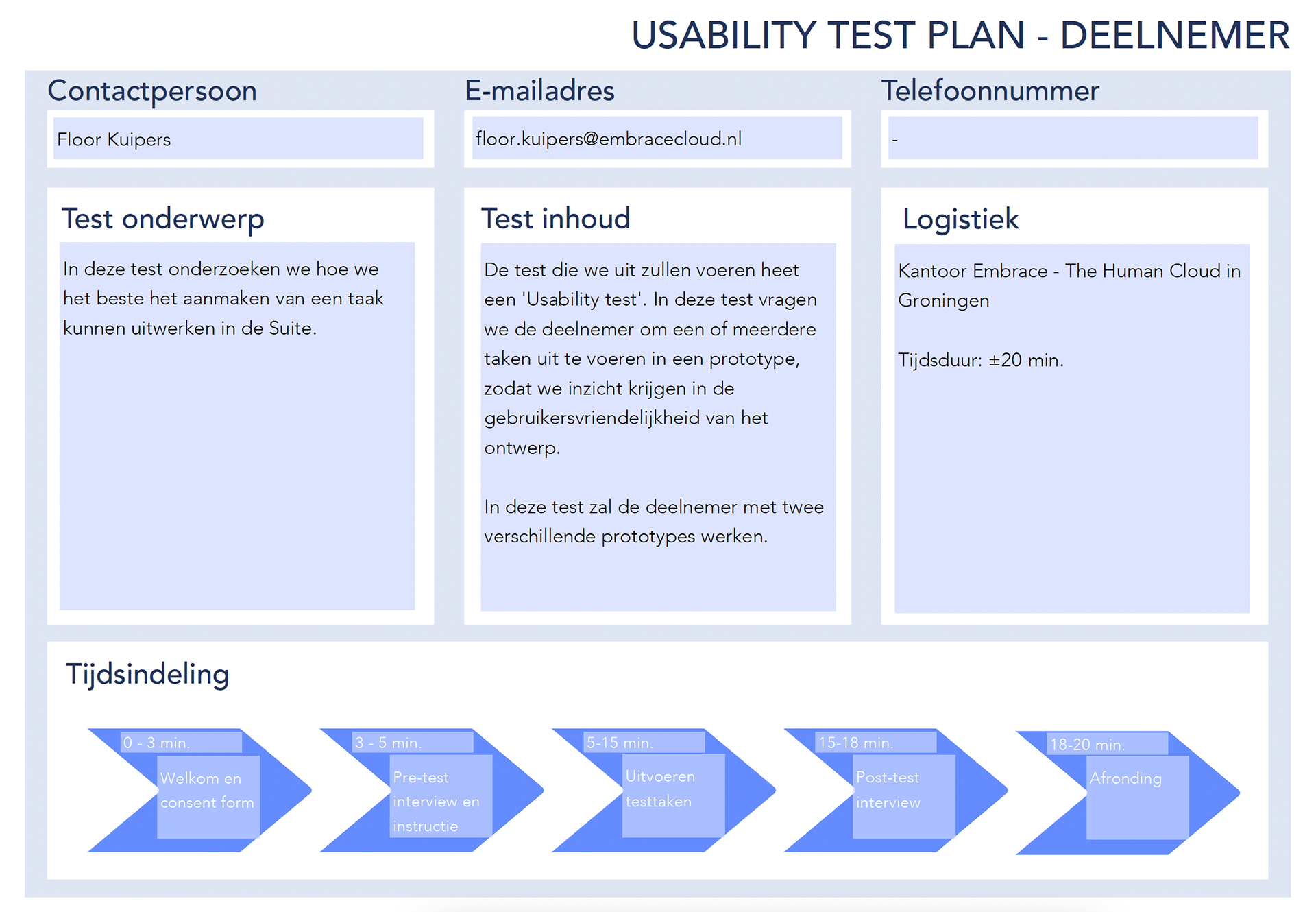
A Usability Test Plan was added as a document to summarize the preparation and content of the test, which is split up into a part that can be shared with a participant (about the logistics and topic of the test) and a part that deals with the preparation that needs to be done and brought by the UX Researcher/Designer performing the test.
Creation
Converge
During the Creation phase of the project we converge the findings into a specific usability test, to see to what extent the created protocol and documents are effective. The aim was to gain insight into how much work it would be to execute the protocol and whether steps were missing, for example.
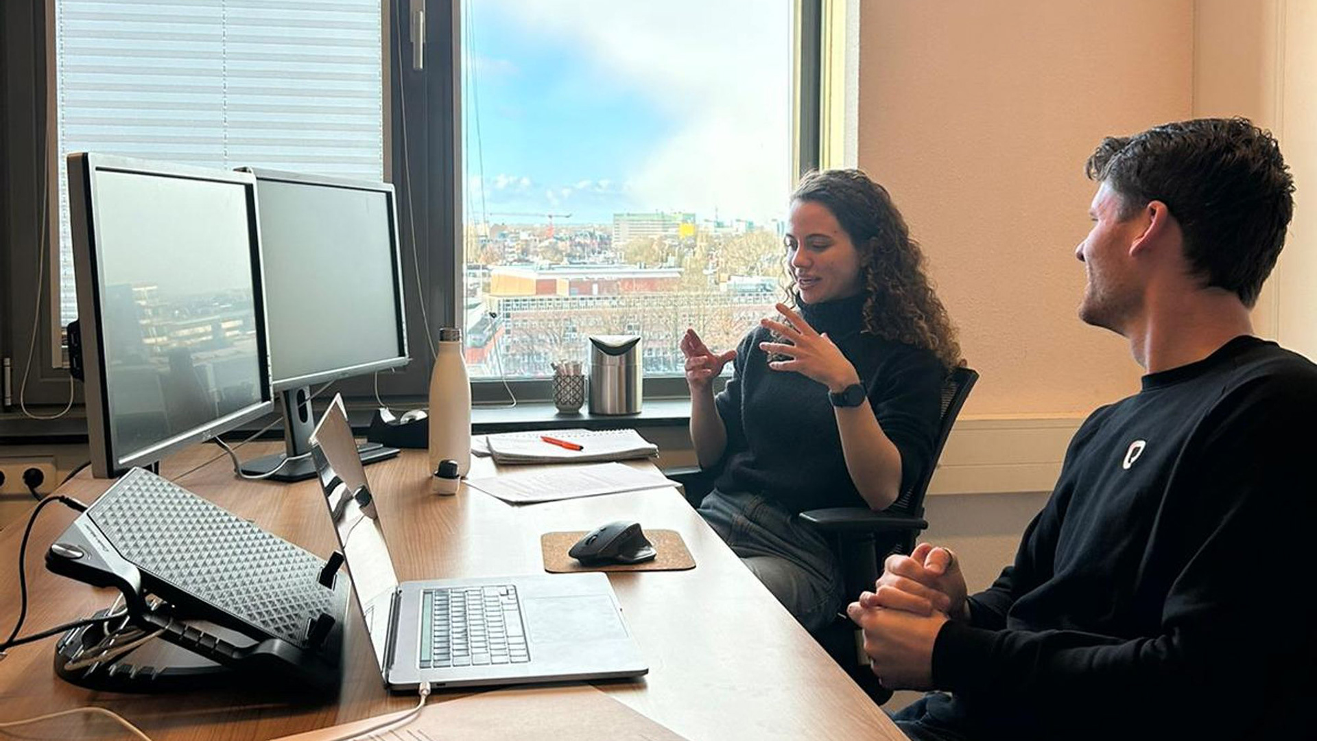
The test that was created was a comparative usability test, where we tested two versions of the same interface in which the users are support administrators of a housing corporation and they have to assist a user with their problem.
The usability test was performed at the office of Embrace, with seven participants who interacted with both prototype A and prototype B. Information was gathered through a pre- and post-test, video-footage, screen recording, audio-recording and taking notes during the test.

Processing
Converge
The data-processing was done using a Thematic Content Analysis approach.
The first step in processing of the data was to analyse and code the (screen-)recordings and notes and convert to text everything that could be remotely relevant, making highlights of note-worthy aspects. These noteworthy aspects were then coded, to make categorization easier later on.
Next, all of these findings were all added to a FigJam board, first divided by the corresponding participants. This would be useful later on, because this gave quick insight into how diverse the opinions were on a theme: did all of the comments come from one participants or was this a shared opinion?
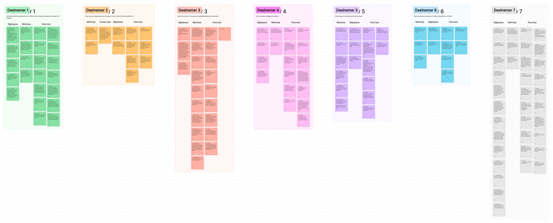
Thematic content analysis - notes per participant
Then, based on the coding of the individual sticky notes, different themes started to emerge. The findings were then moved on the board to the found themes. It was assessed whether or not the different themes could be combined with or split up into other themes, to be able to conclude the thematic content analysis.
Finally, concrete and summarized overal findings per theme were summed up in each of the FigJam blocks, to be able to present the findings to the Design Team and other stakeholders.
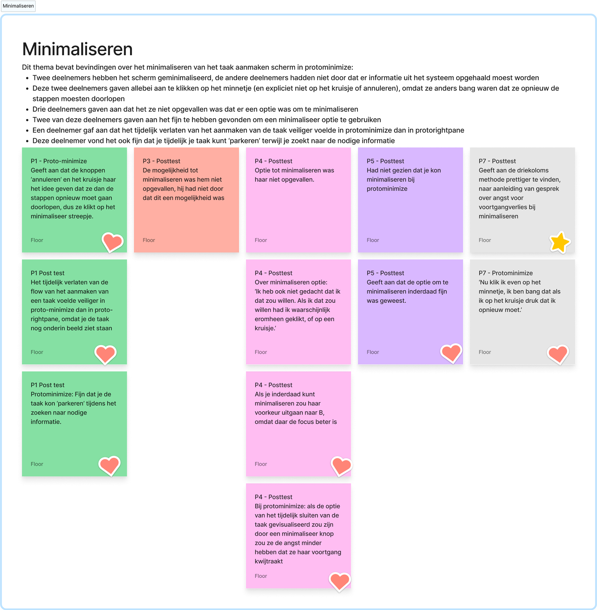
Example of an important theme
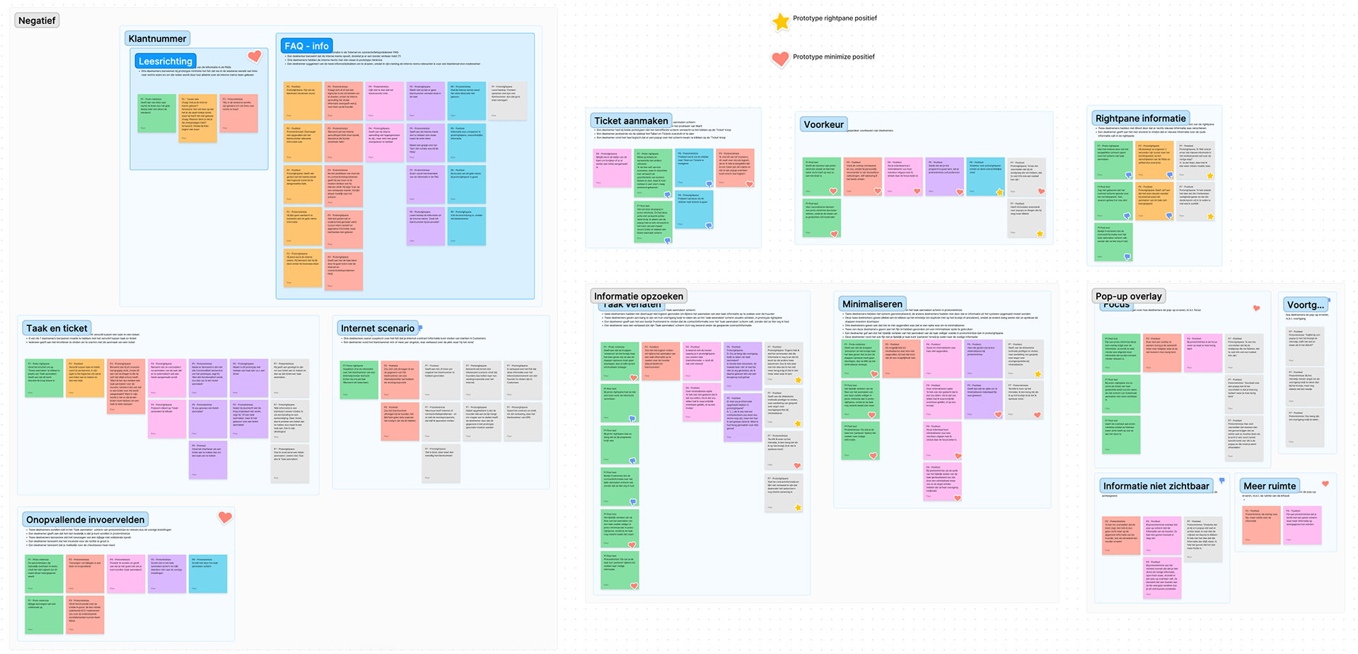
Thematic content analysis - divided by most relevant themes
Evaluation
The test in itself and the process of creating the protocol were evaluated at the end of the project. The results of the project were presented to a large number of colleagues involved with the designs (product designers, product owners, marketing).
The test had a good number of participants: after participant number 5, no significant usability issues were found. Also, the designs that were used in the test were not created by me, but by a fellow UX designer, so during the test execution I was not biased towards any design choices. Although you always try to be as neutral as possible, it is more difficult to do so if it is your own designs being tested.
It turned out that the tasks were a little too ambitious for this test and user group. Because the users were colleagues at Embrace, instead of end-users, the background knowledge on the software suites differed substantially. This led to misunderstandings and misconceptions about some of the terminology and made the task description too complex.
Generally, both the test and the process were deemed to be a success, since a clear outcome of the test was that prototype B was prefered and concrete reasons were given why. Also the steps that needed to be taken for prototype B to minimize usability issues became very clear. In terms of the process, the design team was very happy to see that the first usability test was performed successfully and found the documentation and dashboard to be of great use for future testing.