About the project
A learning management system (LMS) that provides students and teachers with the information that they need everyday. That provides effective support for teaching, therefore making it more efficient.
Roles: UX researcher, UX designer, project manager
Skills: UX/UI design, prototyping, UX research, project management
Tools: Figma
Challenge
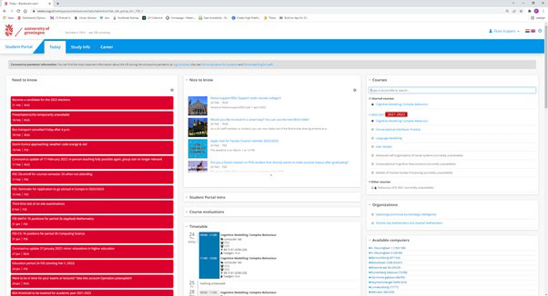
The University of Groningen (UoG) planned on switching to a different LMS, as the then deployed BlackBoard Learn environment was not going to be supported anymore. Thus, all of the LMS options were open, and needed some narrowing down.
There is a need for a learning environment that provides students and teachers with the information they need everyday and that provides effective support for teaching. To a large extent, these goals have already been met by the current LMS of the university, which was called Nestor. The aim of this project was to take it a step further: What elements do students and teachers deem most necessary for optimal use of their Learning Management System?
Solution
My two team-members and I created a design of an LMS that is based on one of the new LMS options (Canvas). The aim of our design was to create the most suitable LMS for the UoG, that meets the users’ needs, based on existing LMS software to make the decision easier for the stakeholders.

Approach
This project followed the five stages of the Design Thinking approach: empathize, define, ideate, prototype and test, with the possibility to iterate between the different phases.

Empathize
User Study
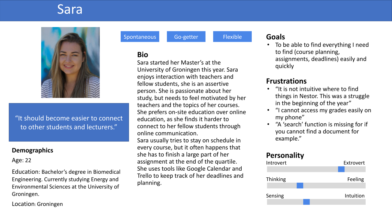
In this initial phase of data gathering, the aim was to gain insight into the problem space. The primary end users of the interface were students and teachers, as discussed together with the stakeholder of this project. Secondary users we kept in mind were the system support staff.
A general student survey, a survey with students with a performance disability and a questionnaire with the LMS support staff were conducted. Furthermore, a documentation study was performed and observations took place. The data was used to better empathize with the main user groups and to perform a task analysis for these user groups.
Define
Requirements Analysis
To make sure that the main aims of the design are clear, the project constraints and functional requirements were clearly articulated. Prioritization of requirements took place using the MoSCoW method
Find out more about the full list of requirements.

Ideate
Throughout the design process, iterations took place between the different phases (i.e. between Prototyping and Evaluation), to ensure that user feedback is incorporated and that issues can quickly be resolved. These iterations took place in the form of early Low-Fidelity (paper) prototype testing and evaluation of a High-Fidelity digital prototype (created with Figma). After both evaluations, the design was revised and altered or suggestions were provided for future development. The design choices were made based on important design considerations of the product, feedback from users and design patterns.

Prototype
Paper prototype
The paper prototype was shown to four participants, all familiar with the current LMS (Nestor) and all students. Also the Teacher prototype was shown because although usually students would not get to see this part of the LMS, their opinions could add to our understanding of the interaction with the system. The informal usability test was performed using a think aloud protocol.
These initial tests did not result in major changes to the design. Some functionalities were missing in the paper prototype, such as a link between the calendar view and the course page. These were added in the Hi-Fi prototype.
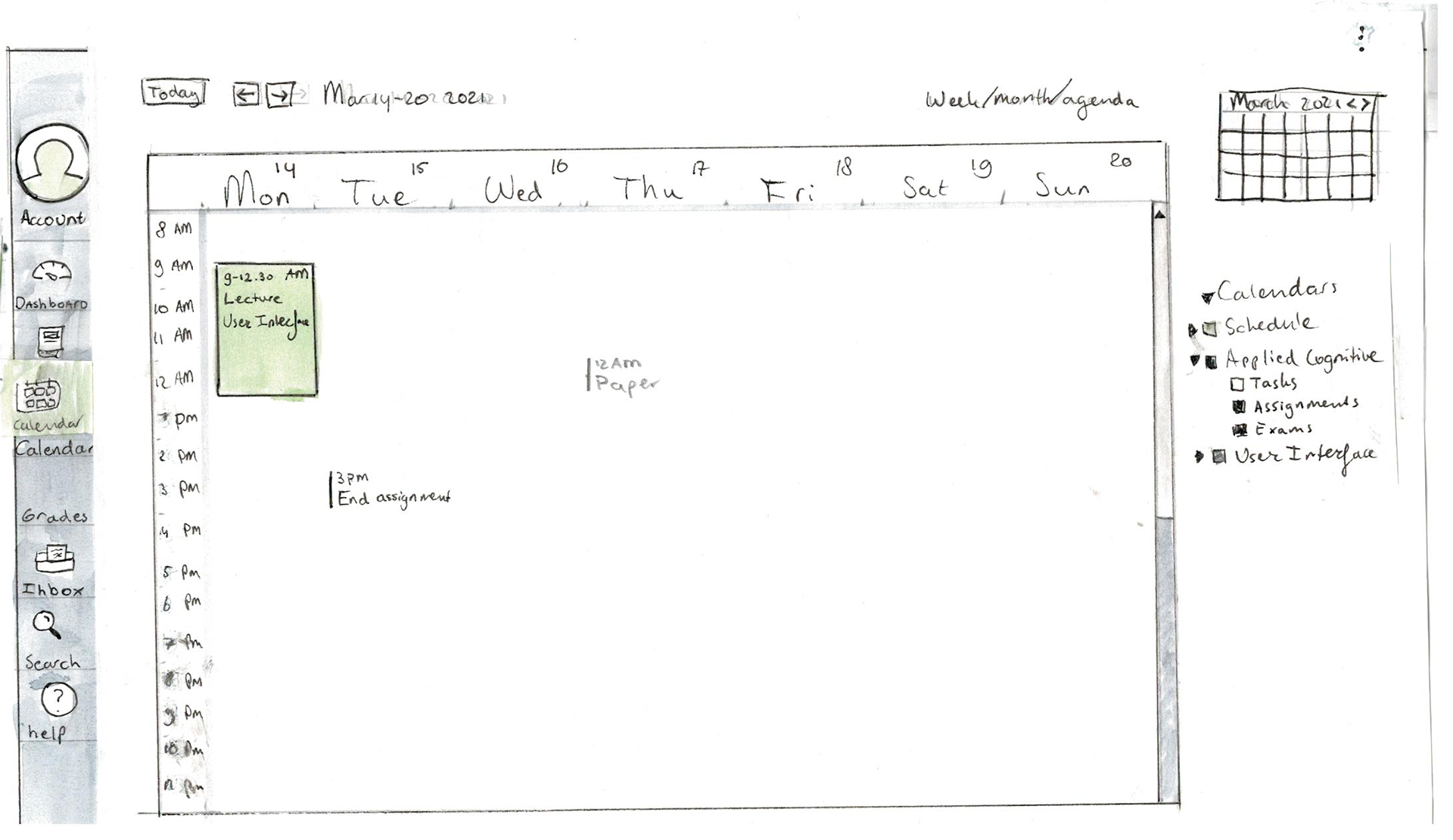
Student view of calendar
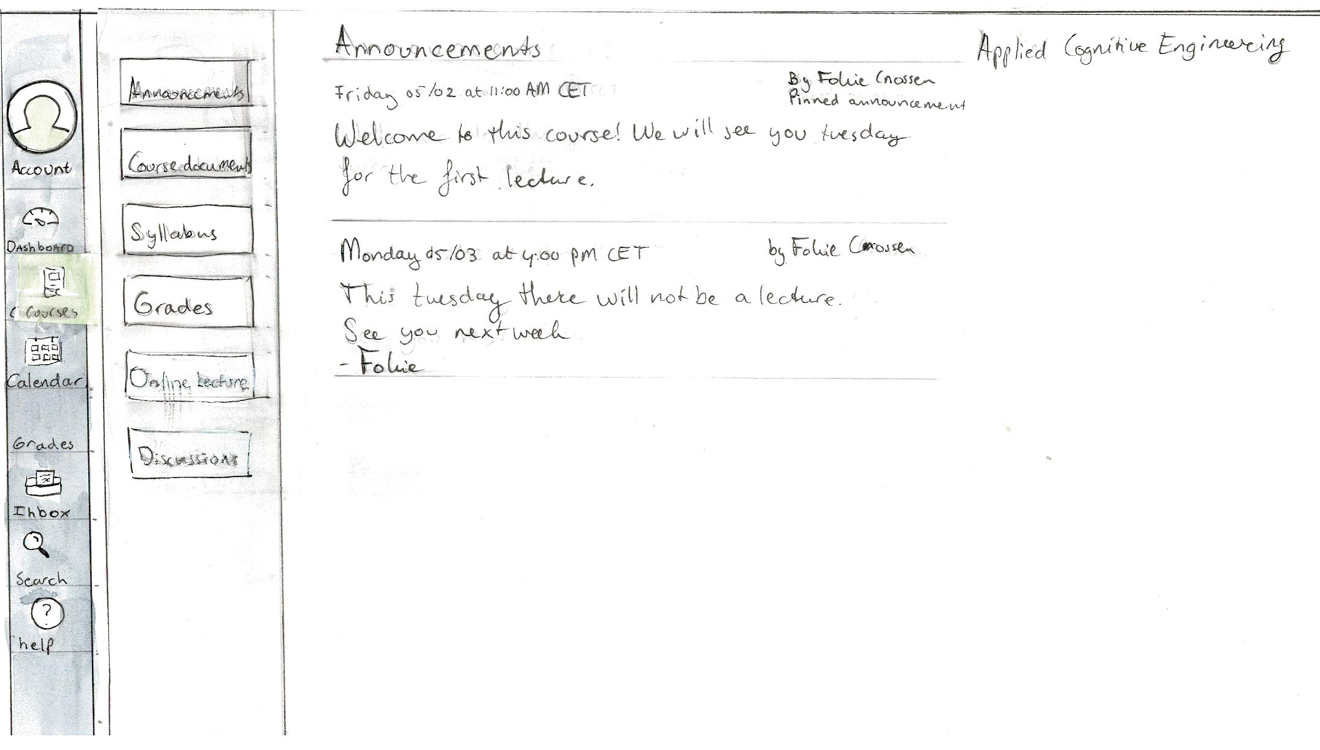
Student view of announcements
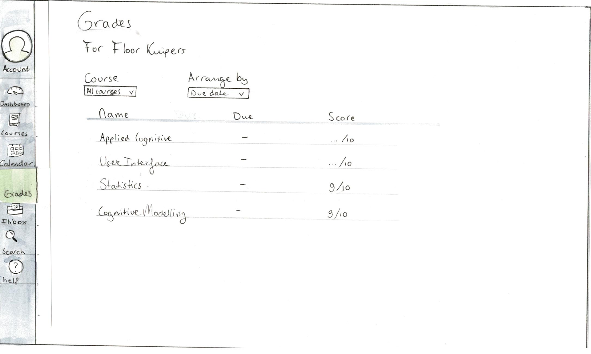
Student view of grades
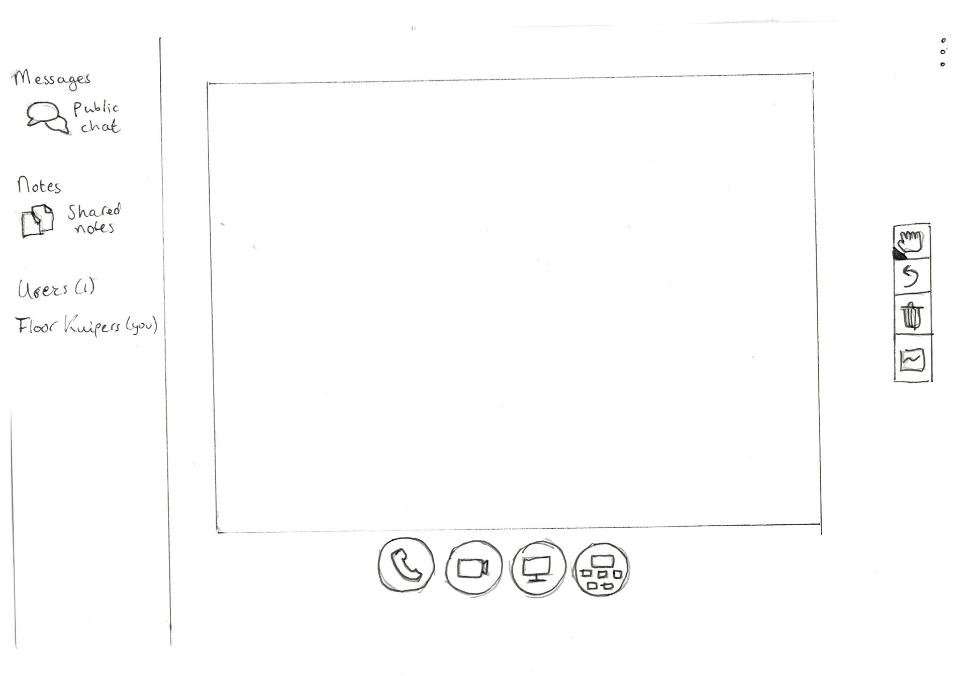
Teacher view of online lecture

Search
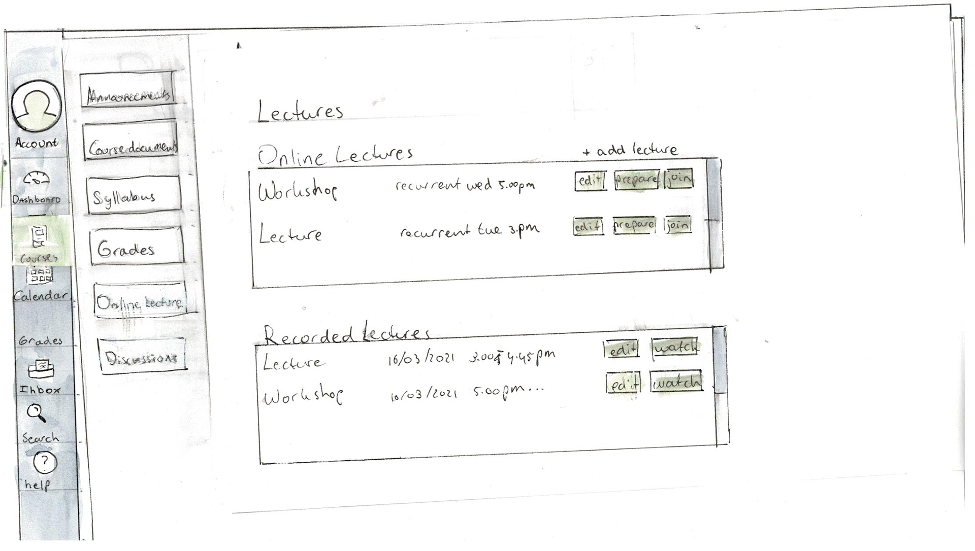
Teacher view of online lectures

Teacher view of dashboard organisation
Hi-Fi Prototype - Student version
Hi-Fi Prototype - Teacher version
Test
Heuristic evaluation
Before the usability test was performed, I performed a heuristic evaluation, as all members of this design-team are representative end-users (students). The aim of the heuristic evaluation was to eliminate potential ‘teething problems’ of the interface, so it works as smoothly as possible for the actual usability test participants. We used the heuristics created by Jakob Nielsen. If there were violations of one of the ten heuristics, it was written down and given a severity score (of 0-4, where 0 means that it is not really considered a usability issue and 4 means that the issue is very severe and should be taken care of immediately).

Usability test
An informal usability test was performed on the paper prototype, as well as a more extensive usability test on the high fidelity prototype. Both usability tests were performed using a think aloud (TA) protocol.
The student interface was tested with 6 participants, all in the age range of 23-26. All participants had never used Canvas before. The teacher protoype was tested with two represetative users, one of whom is a teacher at a University of Applied Sciences (Hanze Hogeschool) and the other participant teaches at an Secondary vocational education (MBO, Alfa College).

End product and conclusion
Due to time-contraints of this project, the final iteration did not result in design improvements but rather suggestions for future development.
Generally, the interface scored very well in the usability tests. Users were mainly very satisfied with the addition of a calendar view. For future development we thus advised to play a bit more with the functionalities of the calendar view: could it be interesting to add a calendar view to the dashboard for example?