About this project
The IVEA app is the result of my master’s thesis, a project provided by the UMCG with the aim of better upholding emergency medical service workers’ knowledge of rarely executed procedures over time.
Roles: (UX) researcher, UX designer, full-stack developer
Skills: UX/UI design, prototyping, UX research, front-end / back-end development, data analysis, data collection, research design, project management
Tools: Figma, VS Code, XCode, TestFlight, Firebase, Flutter, R studio, FigJam
Challenge
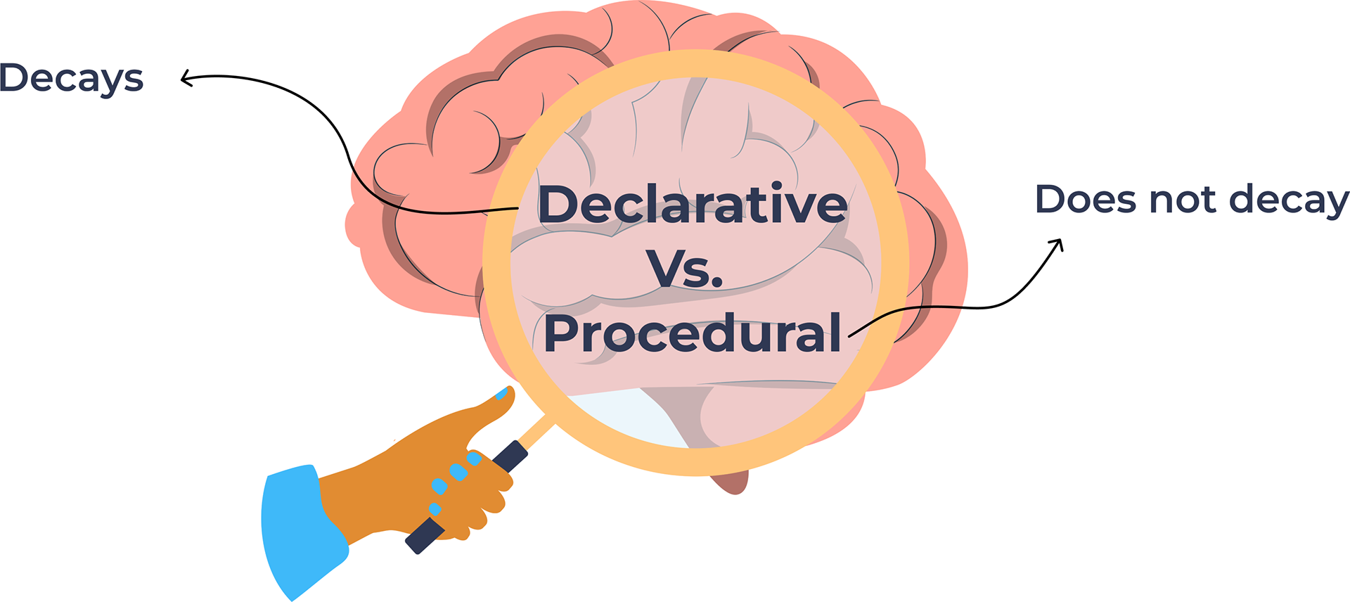
Nurses in the Emergency Medical Services face a broad variety of medical situations. Most of these medical situations require frequently used skills, but other skills are rarely used. In both situations, EMS teams have to be able to take the appropriate steps. It is known that if a skill requires declarative (factual) knowledge to practice it, it is prone to decay over time if it is not used. It can be very impactful and distressing if a rare procedure has to be performed and the EMS team does not know how to take the appropriate steps anymore. This project focused on a solution to this issue of skill decay of rarely executed procedures.
Solution
The end product of this project was the app ‘IVEA’, an application with which nurses can train their knowledge on rarely executed procedures in their own time. This is done through interactive video exercises.
Problem space
The research started with a discovery of the problem space. As this thesis project was part of my research master, the focus here naturally lied strongly on academic research methods, such as literature studies. In regular UX Research it is of course necessary to include end users far more in the exploratory research phase, but the scope of this project did not allow for this type of research.
The literature study focused on understanding how skills are learned and retained as well as the effectiveness of different types of media that are used in education.
Design
Design choices
As the project scope did not allow for initial explorative UX research, the design of the app is mostly based on findings from similar applications for medical education, for instance the color scheme and look and feel. It was apparent that fresh-looking colors (like light-blue, purple, mint-green) are popular for the purpose of medical education.
The app should portray a calm, non-urgent, environment that invites a user to use it regularly. App environments that deal with more urgent situations, such as CPR information apps, generally utilize more pressing colors (such as bright red).
Furthermore, the design patterns used in the application are strongly based on Material Design patterns (i.e. button shapes, scale and proportion, typography, etc.).
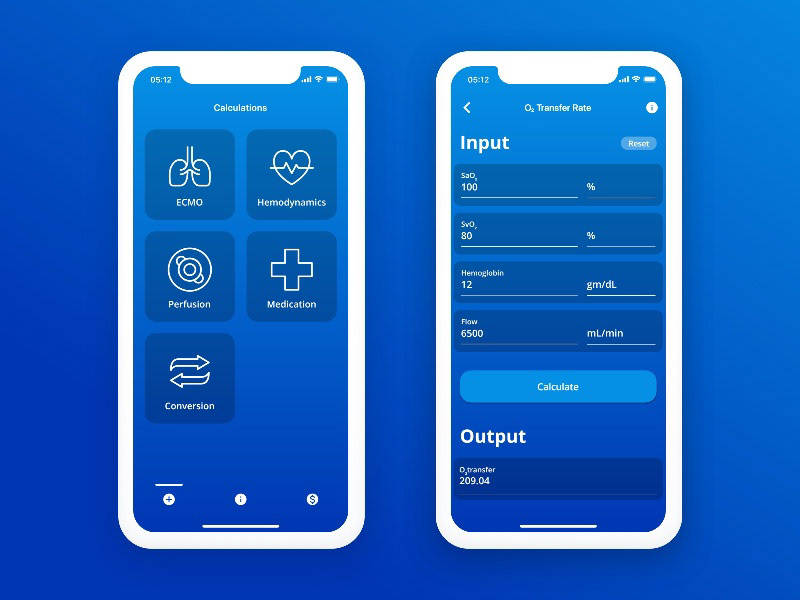
Inspiration for my designs: Mediweb — Medical Calculators by FiveDotTwelve (2020)
Inspiration for my designs: Learning App - Home screen by Lift Agency (Lift Agency, 2020)
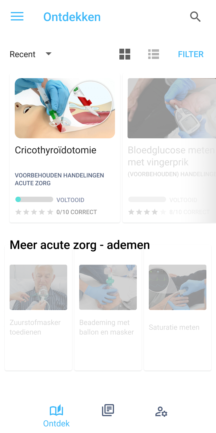
Furthermore, it is important that the information that users want to view is findable, so other applications generally avoid showing too much irrelevant information in one place. This is often done by using Tile or Card designs, thereby sectioning the different blocks of information. This design pattern is also used in the current application.
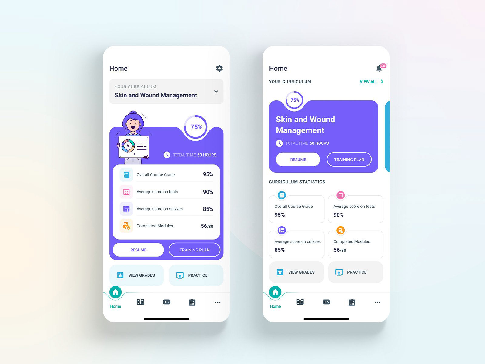
Finally, the different necessary menu items are brought to a minimum, so the user flow is kept as simple as possible. This resulted in four main components: the Home/Discovery screen, the Overview
screen, the Video screens and the Personal screen.
screen, the Video screens and the Personal screen.
The Home screen offers a quick access to the most recently viewed topics and their related topics. The Overview screen allows users to navigate through the different types of topics (e.g. respiratory topics or trauma skills topics) and offers a search function. The Video pages display an overview of the different training videos and the actual interactive videos.
The Personal page displays the user’s name and the option to give feedback on potential bugs. This addition was made because within the scope of this research, the application is likely to only be developed as a beta application. This usually brings about sporadic errors and bugs.
Home/discovery page

Overview page
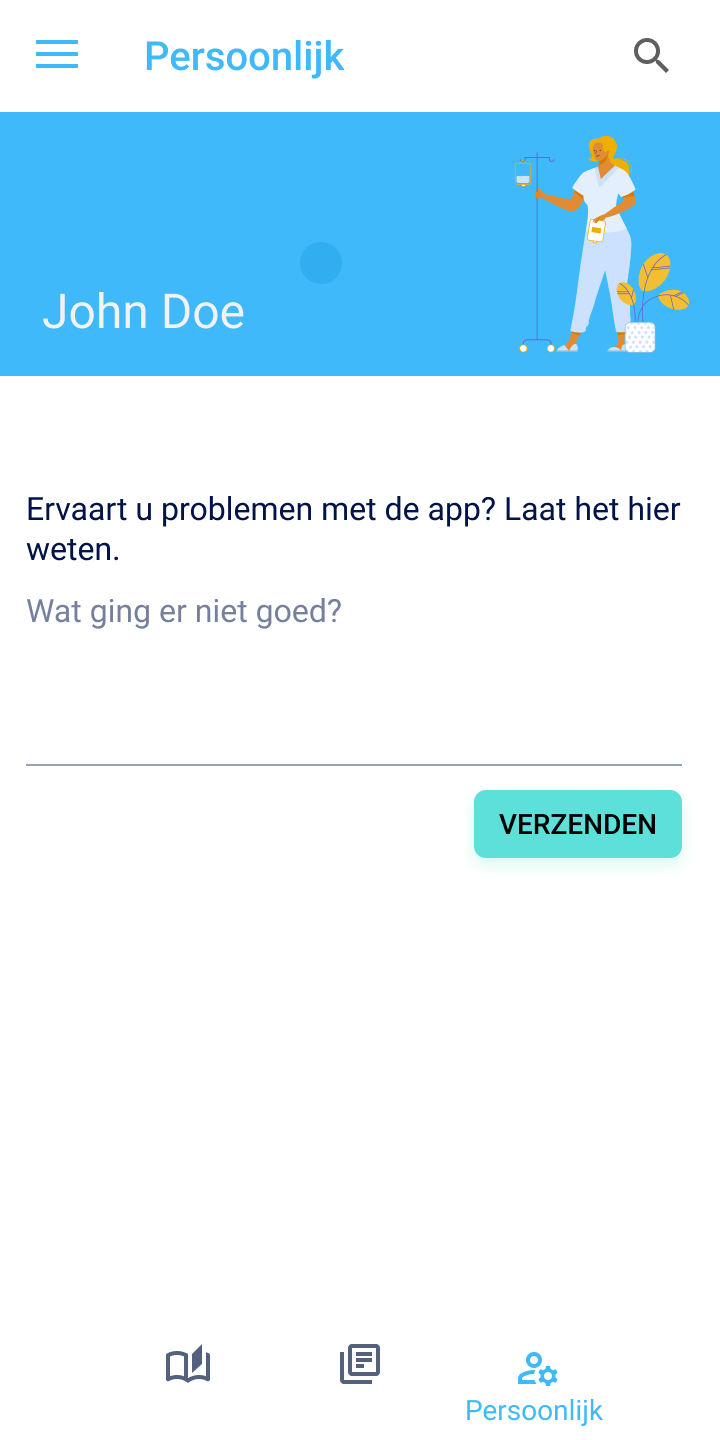
Personal page
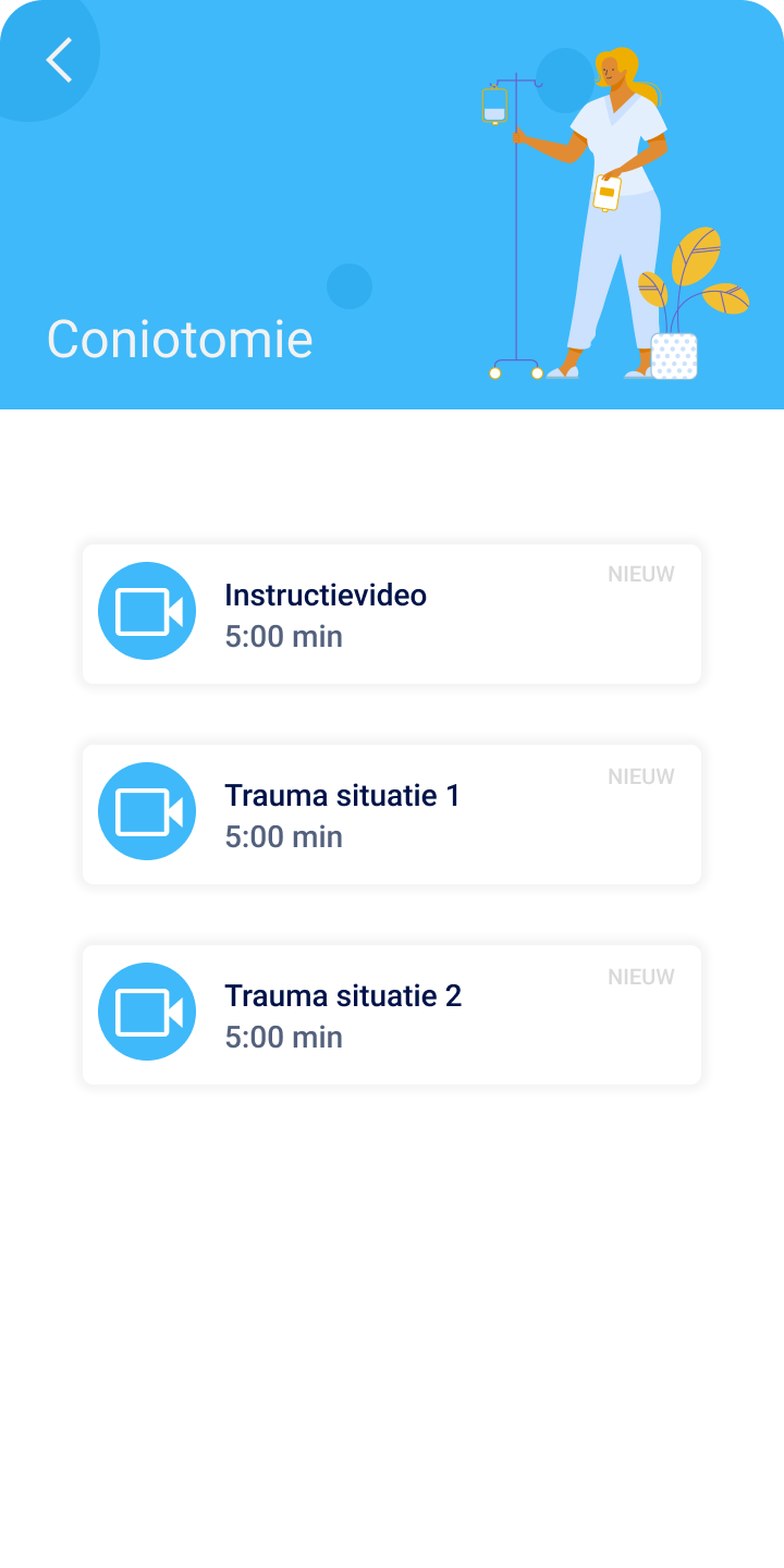
Video overview page
Responsiveness
The distribution of different devices of the participants and end-users is unclear, so the application design has to work for both Android phones and iPhones.
The application also has to be responsive to the orientation of the device. The designs work for both horizontal and portrait mode. Ideally, the application would finally be responsive when switching from a phone to a tablet size. However, since the aim of this research is to create a mobile phone application, this feature is not designed for now.
Landscape mode video

Portrait mode video
Suitable for both Android and iOS
Accessibility
In line with the design choices in terms of color, a color scheme is created that is also accessible for visually impaired users, for instance users who are color blind. A scheme with contrast ratios was created for all four types of colorblindness (Deuteranopia, protanopia, tritanopia and achromatopsia).
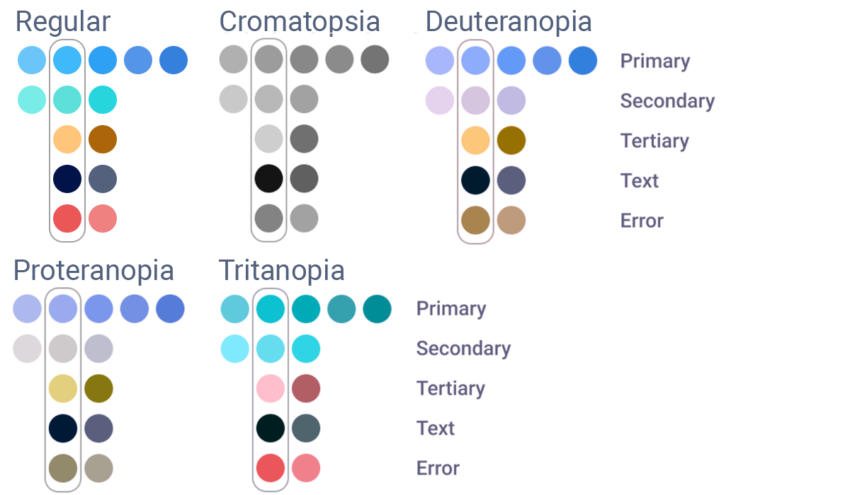
Colorblindness schema
Development
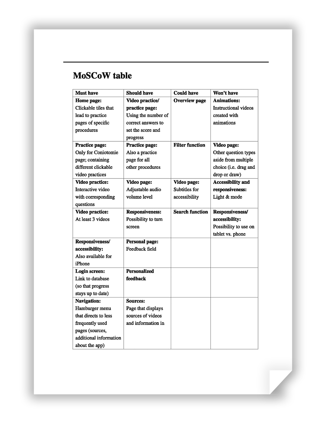
MoSCoW
For the development of the design, the open-source UI software development kit Flutter was used. This kit allows for native app development for both iOS and Android, therefore ensuring an efficient process of development. When planning the development phase, it became apparent that not every designed feature can be included in the beta version of the app.
To ensure proper prioritization, the MoSCoW method of prioritization was used (acronym for Must, Should, Could and Won’t have).
Development choices and walkthrough
Find out more about the decisions made during development and why they were deemed suitable for this application.
Evaluation
Experiment
To see whether or not the intervention of the app was effective, an experiment was performed. In total, 7 participants took part in the experiment, all nurses at the Emergency Medical Service. The experiment tested both the effectiveness of the measure and the usability of the app.
The experimental group was asked to use the IVEA app for two weeks, prior to the 'evaluation' session.
During the evaluation session, participants were asked to perform a cricothyroidotomy procedure, while wearing video glasses and while explaining the steps they are taking. The performance of this procedure by both the control group (who did not use IVEA) and the experimental group was compared. To investigate the extent to which nurses find IVEA useful and usable, usability data was also gathered through an informal, unstructured interview and the System Usability Scale questionnaire.
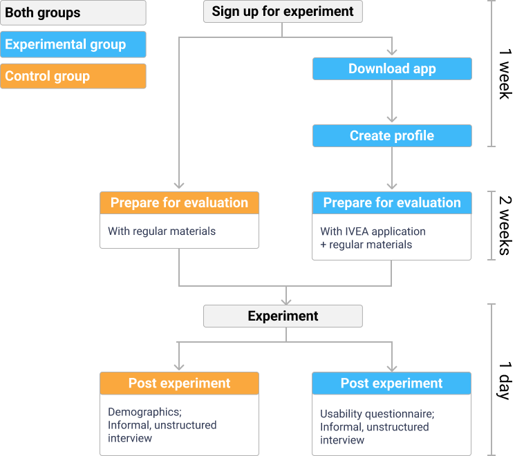
Experiment design
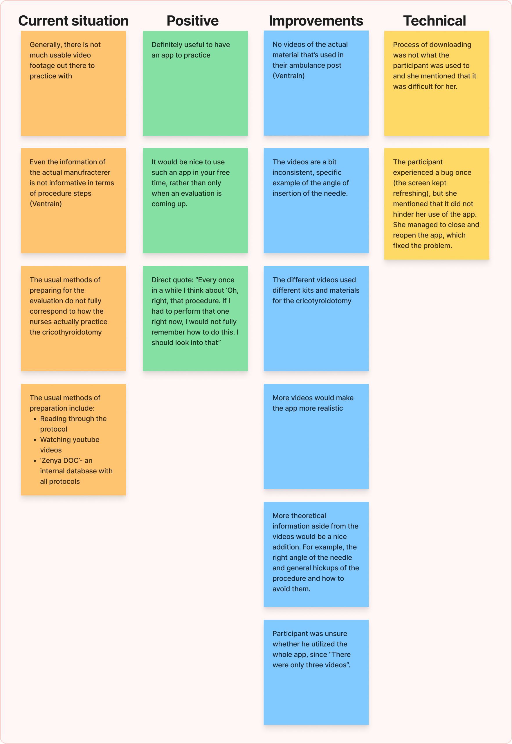
Results
The results were analysed through an expert evaluation and a usability evaluation. The expert evaluation consisted of three Emergency Medical Services trainers and experts looking at the video footage individually and scoring each step of the protocol. These results were then combined by me to find the common ground between the three assessors.
From this, it became clear that it was difficult to draw firm conclusions on the effectiveness of the app. There were simply too many confounding factors: The main issue being the age difference in the experimental group and the control group (the people who were willing to participate in using the app were on average way younger than the control group and therefore had less years of experience).
On the usability, however, great scores were found, with a SUS score of 80.83 (corresponding to a 'good' to 'excellent' interface).
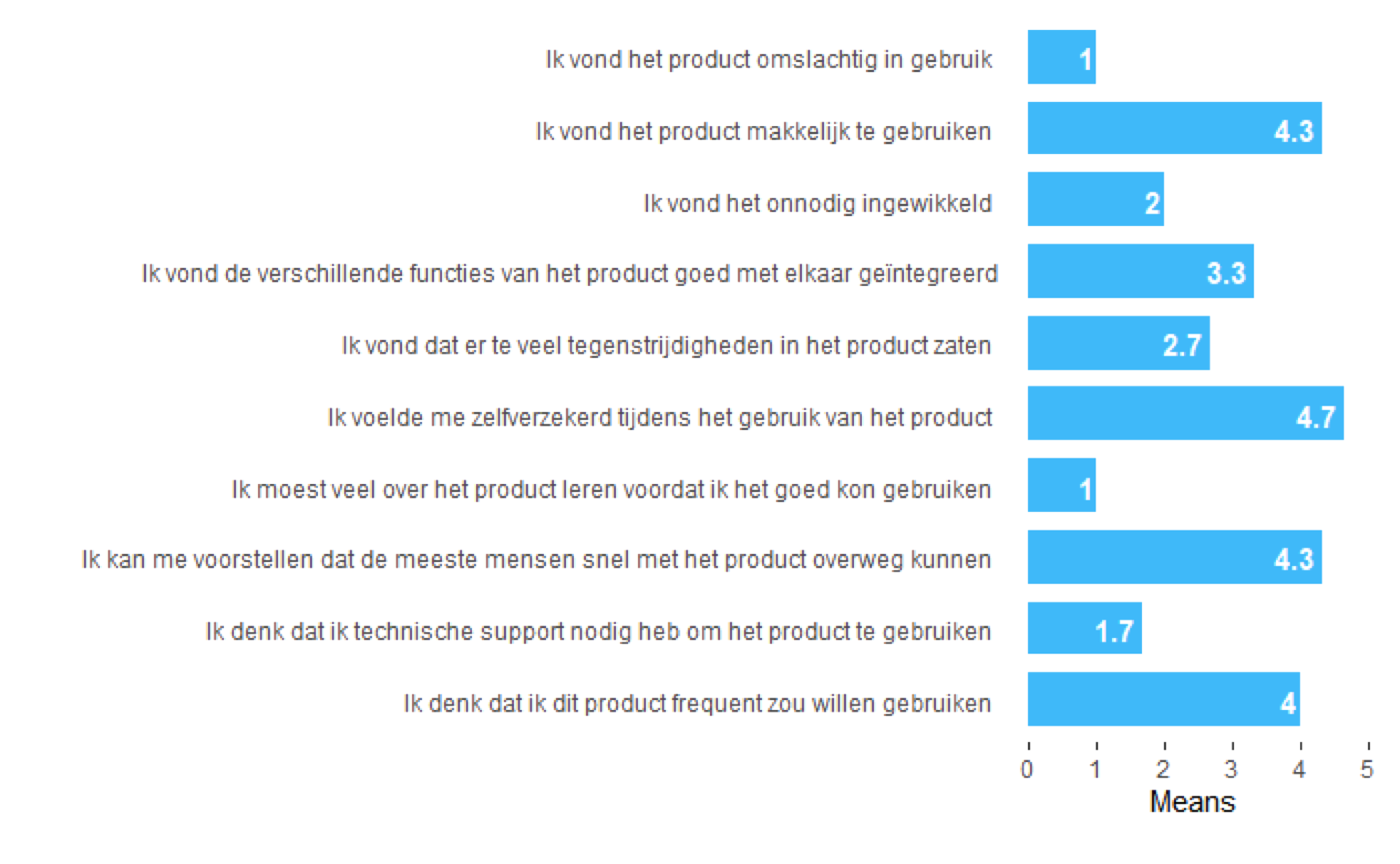
SUS results
From the informal, unstructured interviews a thematic content analysis was performed, where I first highlighted and coded all relevant comments from participants and after this I combined the comments in different themes, based on the found codes.
From this, it became clear that for future development, it would be necessary to include more video footage to practice with and that it is important to keep the video footage consistent.
Concluding remarks
This project shed light onto the possibilities of including technology as a tool to keep up the necessary knowledge as an EMS nurse. The stakeholders were very pleased with the product and hope to continue the work with other graduate students.